Mobile devices make up over half of all website traffic, and that number continues to grow. If your website doesn’t look good on a small iPhone screen, your clients will click away, and you’ll lose business. Clearly, it is essential to know how to create a responsive website that looks great on all devices, but what does that mean, and how can you do it?
Responsive design for websites ensures functionality so that one website can adapt to serve all devices. Achieving consistent website design across mobile devices presents a challenge if you don’t have web development experience. In this guide, we cover five tips to keep in mind for a responsive website that looks right on all devices.
5 Steps to Employ Responsive Web Design
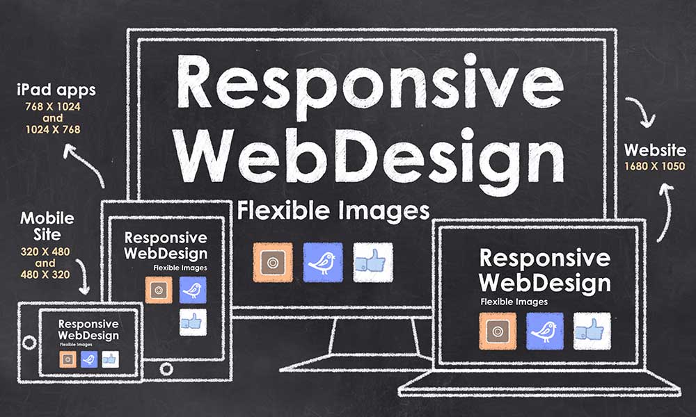
Responsive web design means that your site “responds” and adapts to present images, text, and buttons correctly, depending on the user’s screen size. If you can’t scroll to see everything on the page when you view your site on a mobile phone, you need a responsive web design update.
1. Set Breakpoints
Rather than host separate sites for web and mobile, responsive web design utilize the same HTML for all devices by using CSS breakpoints to alter rendering so that the page display adapts to the user’s device. These defined points allow you to preset the website layout for each screen size, providing consistent usability across all devices.
2. Build on Fluid Grid
A fluid grid positions website elements in scaled columns with no locked locations of fixed dimensions. Flexible grids like the FlexBox layout tool allow your website’s elements to resize automatically to fit the display screen, keeping the look consistent regardless of screen size.
3. Plan for Touch Screens
From mobile phones to tablets, touch screens are becoming one of the main ways people interact with websites. Website accessibility on touchscreen devices demands that all features respond to a fingertip. This often means resizing for ease of access and calibrating dropdown menus and scrolling functions for smooth deployment on touchscreen devices.
4. Optimize Images and Videos
As the saying goes, a picture is worth 1,000 words. On your website, pictures capture interest, which is crucial in engaging site visitors.
Responsive design features allow flexible images and video formats that resize to fit the display, streamline rendering with compressed file formats, and promote progressive loading that prevents off-screen images and videos from slowing down the site.
5. Perform Meticulous Quality Assurance
Verify all responsive web design features through rigorous quality assurance procedures. Use an online responsive design checker to check your website through a variety of mobile devices and operating systems.
Versatility Is Key
Expand your online footprint and reach users on the go with responsive web design. Users expect consistent website display and full functionality from their smartphones. Knowing how to create a responsive website that looks great on all devices empowers your website to deliver a positive user experience every time.
Ready to revamp your website to use a responsive design that works on any device or screen size? Contact Randy Speckman Design for custom web design and development.