Responding to the technology trends is easier with responsive web design
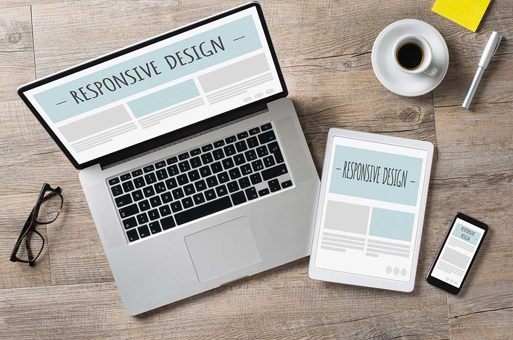
So, what are the latest industry news and insights on responsive website design telling us? As technology has rapidly advanced, so has the way in which people interact with websites. There’s a positive trend in mobile use, which means an increasing number of website visitors find you on their mobile devices.
However, moving away from the standard desktop view requires an entirely different interface if you want these visitors to have a great customer experience on your website. How does your site measure up?
Below, we discuss three responsive website design trends and how you can easily adapt to the ever-changing digital landscape.
Top 3 Responsive Design Trends to Help Your Business Keep Up
With machine learning on the rise, industry news and insights indicate that responsive website design has become essential for maintaining the interest and trust of a website’s visitors. How can you improve your site’s user experience? Here are three ways:
#1 Employ Tools for Rapid Prototyping for a Test Run (or Two)
Rapid prototyping tools allow designers to create high-fidelity copies of the same website to ensure that the website interface can correctly adapt to any size device. It’s the best way for designers to test the usability, natural language processing, and aesthetics of websites without coding.
UX, UI, and web designers all benefit from using rapid prototyping tools, saving hours you might otherwise waste creating multiple interfaces.
#2 Adaptive Delivery Moves Fast to Avoid Losing Customers’ Interest
According to the latest industry insights, it takes mere seconds for a site visitor to give up when they notice a lagging website. Due to rapid advances in technology, nobody has the patience to wait for a website to load. Instead, they click off and find another site.
A responsive website will be able to read the size of the device your visitor is using, select one of the interface codes (for desktop, mobile, tablet, etc.), and load the correct size within seconds. If that delivery takes more time than a user is typically willing to wait, your site loses out.
Adaptive delivery eliminates the lag by detecting the incoming device and loading what’s compatible with that size screen (rather than loading all interfaces at once). It’s fast and holds the attention of the person trying to access the website.
#3 Personalize Visuals and Movement
Customized website design is integral to brand image and customer satisfaction. Users are more likely to interact with faster websites that adapt to the size of their screens. However, they also seek out websites with unique identities.
How can you personalize your website to fit your brand?
- Animated visuals
- Color schemes
- Font styles
- Brand iconography or imagery
- Authentic photography
You should also try to include moving parts, such as transitions and videos, to pique interest.
Professional Website Design for the Latest Technologies
At Randy Speckman Design, we can optimize your interface to improve website traffic, customer satisfaction, and general interest. Our professionals continuously track the latest industry news and insights for website building and design—connect with us online today!